Customized Quote

Infographic

Written by Scott W Johnson

The Life Insurance Infographic

Whole Vs Term Life Insurance, from time to time publishes useful infographics and piktocharts to help explain life insurance principals, concepts, and costs.  Below are some of our more popular inforgraphics available.

Consumers and Businesses are free to republish one of our life insurance infogrpahic as long as the following two criteria are met:

1.  WholeVsTermLifeInsurance.com must be stated as the author of the infographic, image, or piktochart.

2.  A "do follow" backlink must accompany the post to www.wholevstermlifeinsurance.com.  A do follow backlink, not a no follow backlink.  (The exception to this distinction is made where social platforms, such as pinterest only allow for a nofollow backlink.)

About Life Insurance Infographics:

Infographics are a graphical representation about something, often containing key details.   They usually utilize photos, charts,and various graphics to assist in simplifying a given subject.  Infographics are often used to assist consumers or business people in understanding a complicated subject.  

Infographics about life insurance contain detailed information concerning life insurance concepts, costs, and policy forms.  They can help consumers understand the complex world of life insurance.  Our life insurance infographics hopefully assist you, the consumer, in understanding the world of life insurance.

PHS Infographic:

Life Insurance Infographic about PHS

This headline picture was created to assist with the impression that FSR and PHS ratings are confusing and that most people do not truly understand them.  We understand this. To that end we created an entire article to assist people in understanding Policyholder Surplus and their use. Financial rating generally become more important the longer you are planning on holding a life insurance product.

Roth IRA vs Regular IRA Infographic:
INofographic Buying power of backdoor roth ira

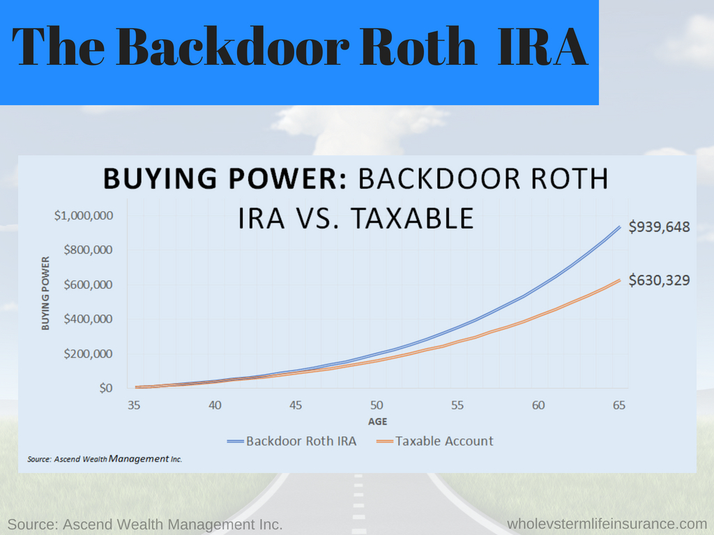
This simple graph about the increase in savings from a Roth IRA vs a Taxable IRA clearly demonstrates the differences and values between the two.  Although this site focuses on insurance and not investments, the two do come together at during whole life insurance sales.  Some insurance agents and indeed insurers content that certain participating whole life policies compete in the retirement income world. Therefore an article about IRAs, Roth IRAs, and 401Ks is warranted.

Infographic about Single Premium WL:

Single Premium

This simple definitional infographic was created with about twelve others to assist consumers is getting quick definitions throughout many of articles in a quick and simple to read topic.   This specific article: Single Premium Life Insurance is about a form of whole life insurance that has lost popularity over the ages but that still has some serious values.  Single premium whole life may be one of the better options for those consumers that do want a form of permanent life insurance and that have a pile of cash sitting around.   These definitional infographics will be used over and over on numerous articles of all sizes.  We tried to focus on a series of definitions that were beyond just the basic life insurance definitions.

Whole Life Insurance Dividend Rates:
Whole life Insurance graphic

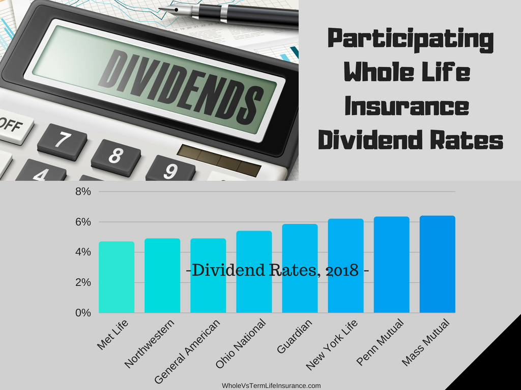
This life insurance graph demonstrates 8 permanent life insurer's dividend rates from 2018.  It is easy to see that all eight carriers are paying very similar rates on their policies. Infographs with this type of information very much assist consumers in understanding salient details.

Sample 30 Year Infographic:
Life insurance infographic sample pricing

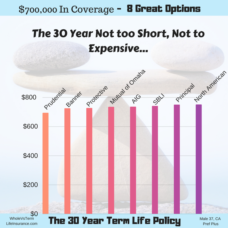
In this simple infographic we provide male thirty seven year old pricing for a standard 30 year term policy. You can see the pricing for all eight insurers are relatively close in line between themselves.   All costing between about $700 and $800 dollars in total per year.  

What is Wrong with Whole Life Insurance Infographic:

life insurance infographic

In this detailed graph we present some of the more common issues happening in the consumer landscape.   Many buyers of life insurance are confused by all of the life insurance options that are available to them.  In this article we discuss some of the major issues with Whole Life Insurance as it stands today.

Infographic about Money and Life Insurance:

How to Save $246,000

This eye catching info-graphic was created with the obvious intent to get eyeballs on a simple way to save money when buying life insurance.   The technique to doing this is not complicated, but the concept is more advanced than some might think.

Infographic about Trusts:

Infographic about Insurance

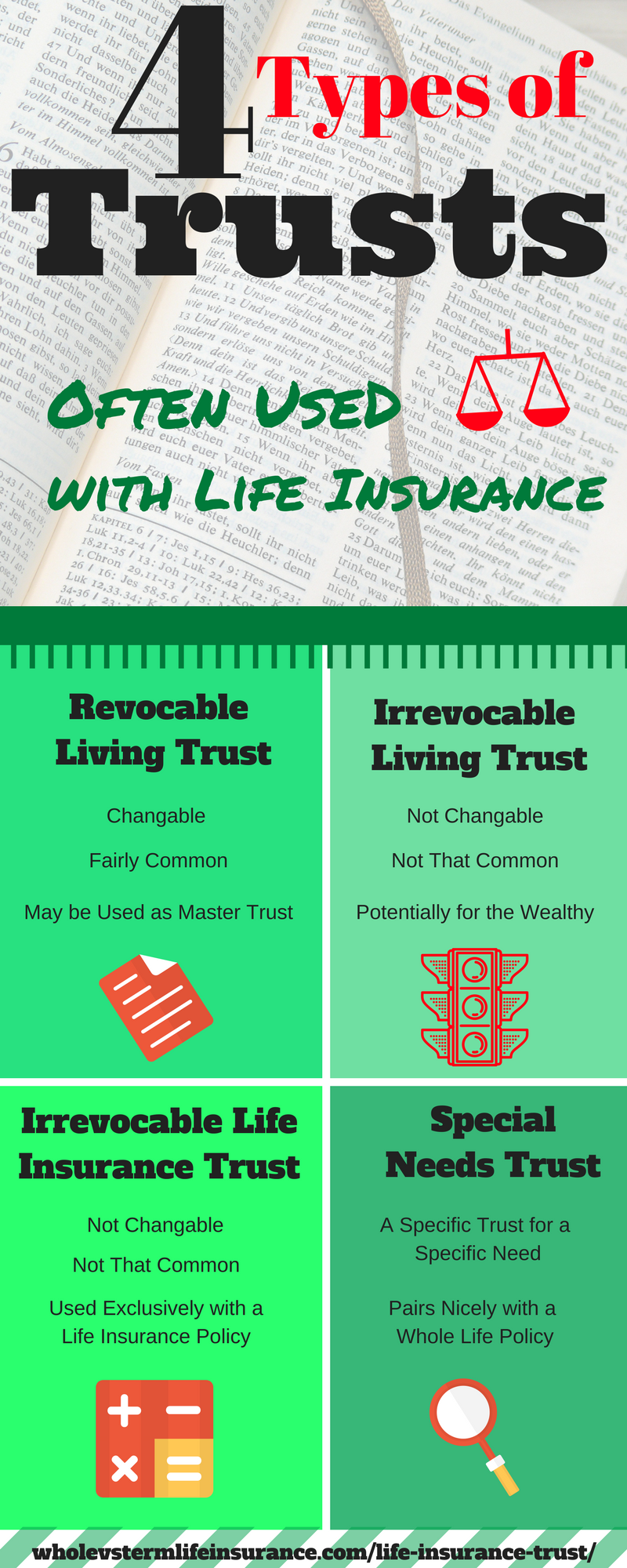
This simple graph was created to assist in a piece that we wrote about trust considerations.  Contrary to popular belief there is no one trust with life insurance transactions.  In our short article on this topic we review the four most common trusts used with life insurance products.  Please see an attorney whenever you are considering a trust or any legal consideration.

Infographic about Sample Life Rates:

Sample Life rates - infographic

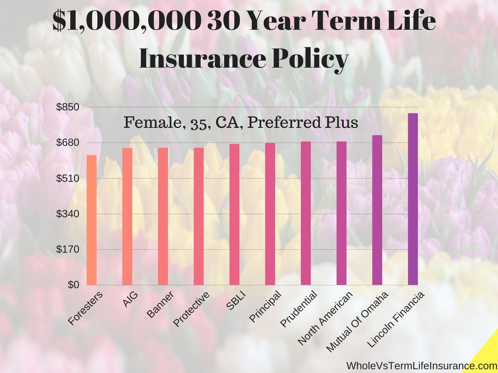
A simple straightforward chart that shows term pricing for a female from 10 different insurers.  Although the exact pricing is intentionally not shown, you can see the cost variation with this piktochart.

Infographics about Term Life Insurance Pricing:

10, 15, 20, 25, 30 year term policy life insurance infographic

Countless articles on the internet can tell you the simple pricing for a life insurance product.  But a detailed infographic can often do it in a much simpler method.   Infographics about life insurance pricing really can assist consumers in finding the best priced policy.

Life Insurance Shopping Tips for Stay at Home Spouses:

life insurance stay at home spouses

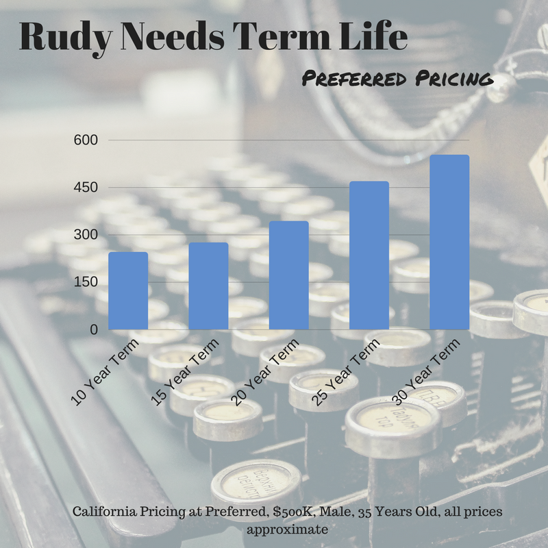
This piktochart was used in an article about life insurance pricing for a thrity five year old male who needed $500,000 in term life insurance.   One can clearly see that the the longer the length of the term policy the higher the cost of the premium.

Best Use of Life Insurance Infographic:

Whole Life Insurance infographic

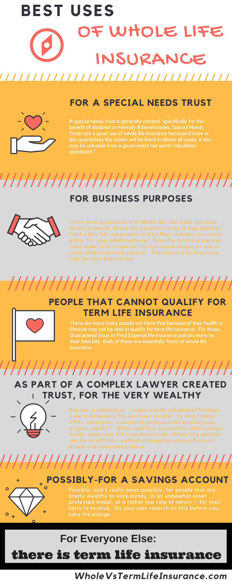
Whole life insurance may be one of the most miss-sold insurance policies out there, possibly with the exception of some forms of annuities.  However that does not necessarily mean that whole life is without purpose.  This life insurance infographic contains four good uses of WL, and one possible good use of whole life policies.  The debate about which form of life insurance to purchase often is the central topic of this blog.

3 Different Term Options Vs Whole Life Infographic:

Life Insurance Infographic

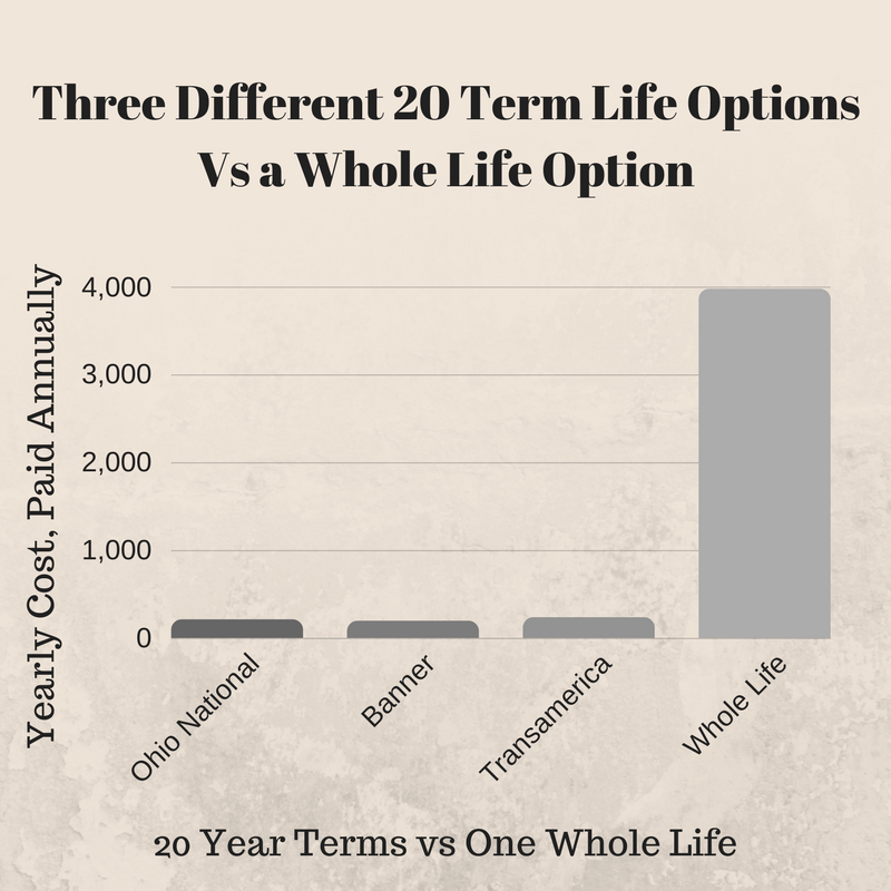
Wondering about the differences between whole and term life insurance policies?   Well there are all sorts of differences, however since the prices is often so different, its difficult to not first start with it.   This insurance infographic shows the pricing differences between 20 year term policies from Ohio National, Banner, and Transamerica vs a Generic Whole Life Insurance Policy.   Does the high cost rule out the permanent policy, maybe not, but perhaps.

Insert Image

Three Year Chart about Whole Vs Term-Invest the Rest:

Select Columns Layout
Life Insurance pictochart
Select Columns Layout

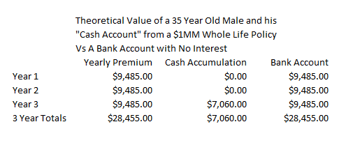
When Term life is sold vs whole life, often it is explained that investing the difference in the cost of the two comparing two policies will result in the best outcome.   Although this is amazingly short sighted in the long run, the immediate initial difference in the first three years, even while earning zero interest is simply amazing.  This insurance piktographic displays this is an easy to understand format.

Dangerous Activities - Life Insurance Infographic

hobbies that make life insurance hard to buy

One important thing to consider when buying term life insurance is that you hobbies could affect your life insurance rates.  Some activities if done frequently enough could either get you denied for life insurance or greatly increase your rates.   Much of this of course depends on the type of activity, the frequency, and the level or severity of the activity.  In regards to the "severity" I am referring to perhaps how high of mountains you may climb, or how deep you may dive.   Professional and Consumer certifications may also be a consideration.  Lastly if you do any of these activities for your career that can also be important.

3 Easy Steps for Stay at Home Dads to Quantity Infographic:

Life Insurance Needs for a Stay at Home Mom

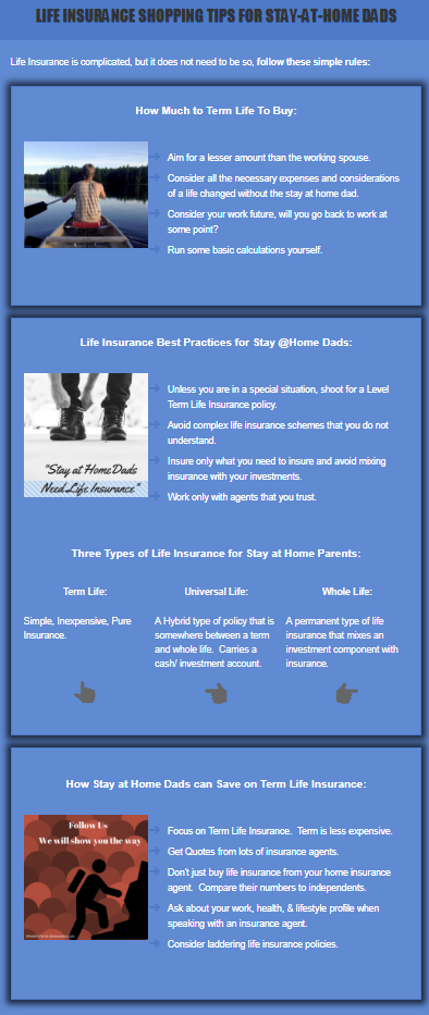
Stay at home dads need life insurance too and this simple and eye appealing life insurance infographic was created to assist consumers in understanding how to calculate exactly how much life insurance they need.   With the golden gate bridge as a background, clients can easily see a simple example of the ten times earning rule regarding life insurance calculation.  Although an imperfect rule - it is solid starting point for life insurance considerations.

About our Insurance Infographics:

Whole Vs Term is proud of our graphics and allow consumer and businesses to reuse and republish our life insurance infographics as long as the follow the following two rules:

1.  WholeVsTermLifeInsurance.com must be stated as the originator and/or author of the infographic , image, or piktochart.

2.  A do-follow backling must accompany the post to www.wholevstermlifeinsurance.com. 

Should you have any questions about this use policy kindly contact us to inquire.

Questions about Insurance Infographics:

How does WholeVsTermLifeInsurance make their insurance infographics?

WholeVsTermLifeInsurance builds infographics in one of two ways.  The most popular way is to use a online tool that specializes in the creation of an infographic.

Do life insurance infographics really help consumers understand insurance?

Yes we believe infographics can assist consumers in learning about all types of financial products including, all insurance products.  It is important to recognize though that all insurance related infographics are simplifications of very complicated coverage situations.  Not all situations are the same.

What tools are used to assist in making these life insurance infographics?

It depends on the specific chart or graph.  First it starts off with knowledge and some research.   We pull our quote numbers form online life insurance rating systems.  Sometimes the charts are used with nothing more than Microsoft Excel and or Microsoft Word.  We sometimes use an online tool called Canva.  There are other tools that we may, on occasion use.

Where do life insurance infographics help the least?

Life insurance infographics help the least when dealing with very specific situations.  It may initially help you to see a chart of life insurance premiums for a forty year old male.  But if you are a 42 year old female with asthma, that charge will not assist you that much.

Thank you for reading and viewing, please see our disclosures and privacy policy.

Privacy Statement life insurance infographic
Always Speak with a licensed agent
Content Protection by DMCA.com
Marindependent Insurance Services LLC

The Life Insurance Infographic

Whole Vs Term Life Insurance, from time to time publishes useful infographics and piktocharts to help explain life insurance principals, concepts, and costs.  Below are some of our more popular inforgraphics available.

Consumers and Businesses are free to republish one of our life insurance infogrpahic as long as the following two criteria are met:

1.  WholeVsTermLifeInsurance.com must be stated as the author of the infographic, image, or piktochart.

2.  A "do follow" backlink must accompany the post to www.wholevstermlifeinsurance.com.  A do follow backlink, not a no follow backlink.  (The exception to this distinction is made where social platforms, such as pinterest only allow for a nofollow backlink.)

About Life Insurance Infographics:

Infographics are a graphical representation about something, often containing key details.   They usually utilize photos, charts,and various graphics to assist in simplifying a given subject.  Infographics are often used to assist consumers or business people in understanding a complicated subject.  

Infographics about life insurance contain detailed information concerning life insurance concepts, costs, and policy forms.  They can help consumers understand the complex world of life insurance.  Our life insurance infographics hopefully assist you, the consumer, in understanding the world of life insurance.

PHS Infographic:

Life Insurance Infographic about PHS

This headline picture was created to assist with the impression that FSR and PHS ratings are confusing and that most people do not truly understand them.  We understand this. To that end we created an entire article to assist people in understanding Policyholder Surplus and their use. Financial rating generally become more important the longer you are planning on holding a life insurance product.

Roth IRA vs Regular IRA Infographic:

INofographic Buying power of backdoor roth ira

This simple graph about the increase in savings from a Roth IRA vs a Taxable IRA clearly demonstrates the differences and values between the two.  Although this site focuses on insurance and not investments, the two do come together at during whole life insurance sales.  Some insurance agents and indeed insurers content that certain participating whole life policies compete in the retirement income world. Therefore an article about IRAs, Roth IRAs, and 401Ks is warranted.

Infographic about Single Premium WL:

Single Premium

This simple definitional infographic was created with about twelve others to assist consumers is getting quick definitions throughout many of articles in a quick and simple to read topic.   This specific article: Single Premium Life Insurance is about a form of whole life insurance that has lost popularity over the ages but that still has some serious values.  Single premium whole life may be one of the better options for those consumers that do want a form of permanent life insurance and that have a pile of cash sitting around.   These definitional infographics will be used over and over on numerous articles of all sizes.  We tried to focus on a series of definitions that were beyond just the basic life insurance definitions.

Whole Life Insurance Dividend Rates:

Whole life Insurance graphic

This life insurance graph demonstrates 8 permanent life insurer's dividend rates from 2018.  It is easy to see that all eight carriers are paying very similar rates on their policies. Infographs with this type of information very much assist consumers in understanding salient details.

Sample 30 Year Infographic:

Life insurance infographic sample pricing

In this simple infographic we provide male thirty seven year old pricing for a standard 30 year term policy. You can see the pricing for all eight insurers are relatively close in line between themselves.   All costing between about $700 and $800 dollars in total per year.  

What is Wrong with Whole Life Insurance Infographic:

life insurance infographic

In this detailed graph we present some of the more common issues happening in the consumer landscape.   Many buyers of life insurance are confused by all of the life insurance options that are available to them.  In this article we discuss some of the major issues with Whole Life Insurance as it stands today.

Infographic about Money and Life Insurance:

How to Save $246,000

This eye catching info-graphic was created with the obvious intent to get eyeballs on a simple way to save money when buying life insurance.   The technique to doing this is not complicated, but the concept is more advanced than some might think.

Infographic about Trusts:

Infographic about Insurance

This simple graph was created to assist in a piece that we wrote about trust considerations.  Contrary to popular belief there is no one trust with life insurance transactions.  In our short article on this topic we review the four most common trusts used with life insurance products.  Please see an attorney whenever you are considering a trust or any legal consideration.

Infographic about Sample Life Rates:

Sample Life rates - infographic

A simple straightforward chart that shows term pricing for a female from 10 different insurers.  Although the exact pricing is intentionally not shown, you can see the cost variation with this piktochart.

Infographics about Term Life Insurance Pricing:

10, 15, 20, 25, 30 year term policy life insurance infographic

Countless articles on the internet can tell you the simple pricing for a life insurance product.  But a detailed infographic can often do it in a much simpler method.   Infographics about life insurance pricing really can assist consumers in finding the best priced policy.

Life Insurance Shopping Tips for Stay at Home Spouses:

life insurance stay at home spouses

This piktochart was used in an article about life insurance pricing for a thrity five year old male who needed $500,000 in term life insurance.   One can clearly see that the the longer the length of the term policy the higher the cost of the premium.

Best Use of Life Insurance Infographic:

Whole Life Insurance infographic

Whole life insurance may be one of the most miss-sold insurance policies out there, possibly with the exception of some forms of annuities.  However that does not necessarily mean that whole life is without purpose.  This life insurance infographic contains four good uses of WL, and one possible good use of whole life policies.  The debate about which form of life insurance to purchase often is the central topic of this blog.

3 Different Term Options Vs Whole Life Infographic:

Life Insurance Infographic

Wondering about the differences between whole and term life insurance policies?   Well there are all sorts of differences, however since the prices is often so different, its difficult to not first start with it.   This insurance infographic shows the pricing differences between 20 year term policies from Ohio National, Banner, and Transamerica vs a Generic Whole Life Insurance Policy.   Does the high cost rule out the permanent policy, maybe not, but perhaps.

Insert Image

Three Year Chart about Whole Vs Term-Invest the Rest:

Select Columns Layout
Life Insurance pictochart
Select Columns Layout

When Term life is sold vs whole life, often it is explained that investing the difference in the cost of the two comparing two policies will result in the best outcome.   Although this is amazingly short sighted in the long run, the immediate initial difference in the first three years, even while earning zero interest is simply amazing.  This insurance piktographic displays this is an easy to understand format.

Dangerous Activities - Life Insurance Infographic

hobbies that make life insurance hard to buy

One important thing to consider when buying term life insurance is that you hobbies could affect your life insurance rates.  Some activities if done frequently enough could either get you denied for life insurance or greatly increase your rates.   Much of this of course depends on the type of activity, the frequency, and the level or severity of the activity.  In regards to the "severity" I am referring to perhaps how high of mountains you may climb, or how deep you may dive.   Professional and Consumer certifications may also be a consideration.  Lastly if you do any of these activities for your career that can also be important.

3 Easy Steps for Stay at Home Dads to Quantity Infographic:

Life Insurance Needs for a Stay at Home Mom

Stay at home dads need life insurance too and this simple and eye appealing life insurance infographic was created to assist consumers in understanding how to calculate exactly how much life insurance they need.   With the golden gate bridge as a background, clients can easily see a simple example of the ten times earning rule regarding life insurance calculation.  Although an imperfect rule - it is solid starting point for life insurance considerations.

About our Insurance Infographics:

Whole Vs Term is proud of our graphics and allow consumer and businesses to reuse and republish our life insurance infographics as long as the follow the following two rules:

1.  WholeVsTermLifeInsurance.com must be stated as the originator and/or author of the infographic , image, or piktochart.

2.  A do-follow backling must accompany the post to www.wholevstermlifeinsurance.com. 

Should you have any questions about this use policy kindly contact us to inquire.

Questions about Insurance Infographics:

How does WholeVsTermLifeInsurance make their insurance infographics?

WholeVsTermLifeInsurance builds infographics in one of two ways.  The most popular way is to use a online tool that specializes in the creation of an infographic.

Do life insurance infographics really help consumers understand insurance?

Yes we believe infographics can assist consumers in learning about all types of financial products including, all insurance products.  It is important to recognize though that all insurance related infographics are simplifications of very complicated coverage situations.  Not all situations are the same.

What tools are used to assist in making these life insurance infographics?

It depends on the specific chart or graph.  First it starts off with knowledge and some research.   We pull our quote numbers form online life insurance rating systems.  Sometimes the charts are used with nothing more than Microsoft Excel and or Microsoft Word.  We sometimes use an online tool called Canva.  There are other tools that we may, on occasion use.

Where do life insurance infographics help the least?

Life insurance infographics help the least when dealing with very specific situations.  It may initially help you to see a chart of life insurance premiums for a forty year old male.  But if you are a 42 year old female with asthma, that charge will not assist you that much.

Thank you for reading and viewing, please see our disclosures and privacy policy.

Privacy Statement life insurance infographic
Always Speak with a licensed agent
Content Protection by DMCA.com

This entry was posted in Term Life Insurance, Whole Life Insurance. Bookmark the permalink.

1 Comment

AAH

For a change, there is an article that focuses on a specific topic and is not all over the places. I like the fact that it is actually problem-solving and not just random and baseless subject. Great going!

June 20, 2019 at 5:26 am
Leave A Reply